

Drone Data Layers Explained: What They Show, What They Miss, and Where They Fit In
Map layers are one of the easiest ways to get into drone data. They help us to see variability fairly quick, but also require interpretation before they become reliable management decisions.

There is a certain usefulness in a good high-resolution drone data map.
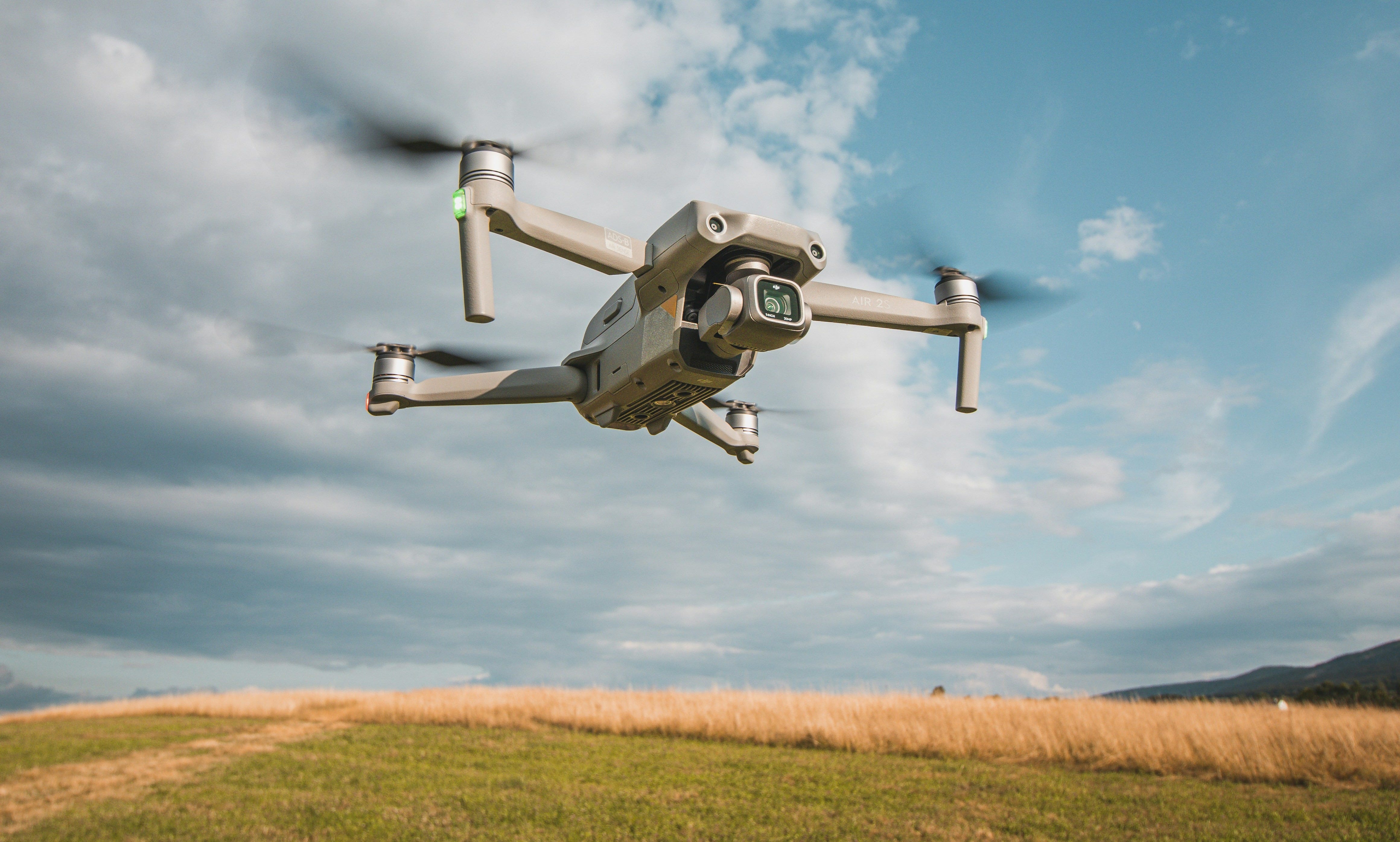
Of course, there’s the obvious: You get to see the farm from above. A bird’s eye view. The rows clearly visible, weak areas start to stand out, if there are any. And patterns emerge that are otherwise difficult to recognise from the ground.
For many farmers, agronomists, and production managers, this is where the drone data journey begins: a visual layer, a coloured map, and a top-down view of the orchard, vineyard, field, or block.
It’s simple, accessible, and fairly easy to understand - and that’s exactly why drone data layers still matter. Their value lies in their simplicity.
Data layers provide a low barrier to entry into the world of precision agriculture by drone flight. And many platforms now make it relatively easy to view RGB maps, Optical 3D Models, NDVI & NDRE layers, Thermal insights, Digital elevation layers, LiDAR Point Cloud maps, etc.
There are several platforms that represent different parts of this broader ecosystem in terms of viewing these insights: Aerobotics, PIX4D fields, DroneDeploy, Agremo, Sentera FieldAgent, DJI Terra, Taranis, and Green Atlas, to name but a few….
Some platforms focus on high-resolution orchard analytics. Others focus on in-field crop scouting. While some focus on plant health layers, prescription maps, vegetation indices, plant counts, or AI-supported monitoring workflows.
Although all of this “other” functionality exits, simple map layers remain useful, are often underrated, and need to be understood in context.
A layer of info could show where variability exists…
Yes, it does not always explain why that variability exists. Neither does it quantify severity, nor separate the crop canopy from grass, weeds, bare soil, shadows, or other sources of image noise.
Layered info may not give the same level of precision as zonal or per-tree outputs, but that does not mean that layer views are weak data assets. It simply means they have a specific role, no more and no less.
On a basic level, drone data layers are excellent for visibility, orientation, communication, and early pattern detection.
On the other hand, zonal outputs help organise variability into practical management areas. While per-tree data gives a more granular view of individual plant performance.
Each data representation holds its own value. The important thing is knowing when a map layer is enough, and when analysis requires a deeper level of interpretation: like utilising zonal or per-plant data outputs.
What Are Drone Data Layers?
Drone data layers are processed visual outputs created from UAV imagery.
In simple terms, the drone flies over the orchard and captures hundreds or thousands of overlapping images. These images are stitched together into a seamless, geo-referenced map called an orthomosaic. This orthomosaic becomes the foundation for many of the outputs farmers later view on a platform or in a drone scan report.
From there, different layer types are generated depending on the sensor used and the processing software applied. These may include RGB imagery, multispectral layers such as NDVI or NDRE, thermal layers, digital elevation or surface models, canopy cover metrics, basic crop health or vigour maps, water stress layers, or plant count and stand establishment layers.
In my book, Drone Data Metrics for Orchard Farming (and as mentioned above in brief) I describe drone outputs as falling into three broad formats: visual and map layers, zonal representations, and individual plant data. Each format has its own level of detail and its own place in the decision-making process.
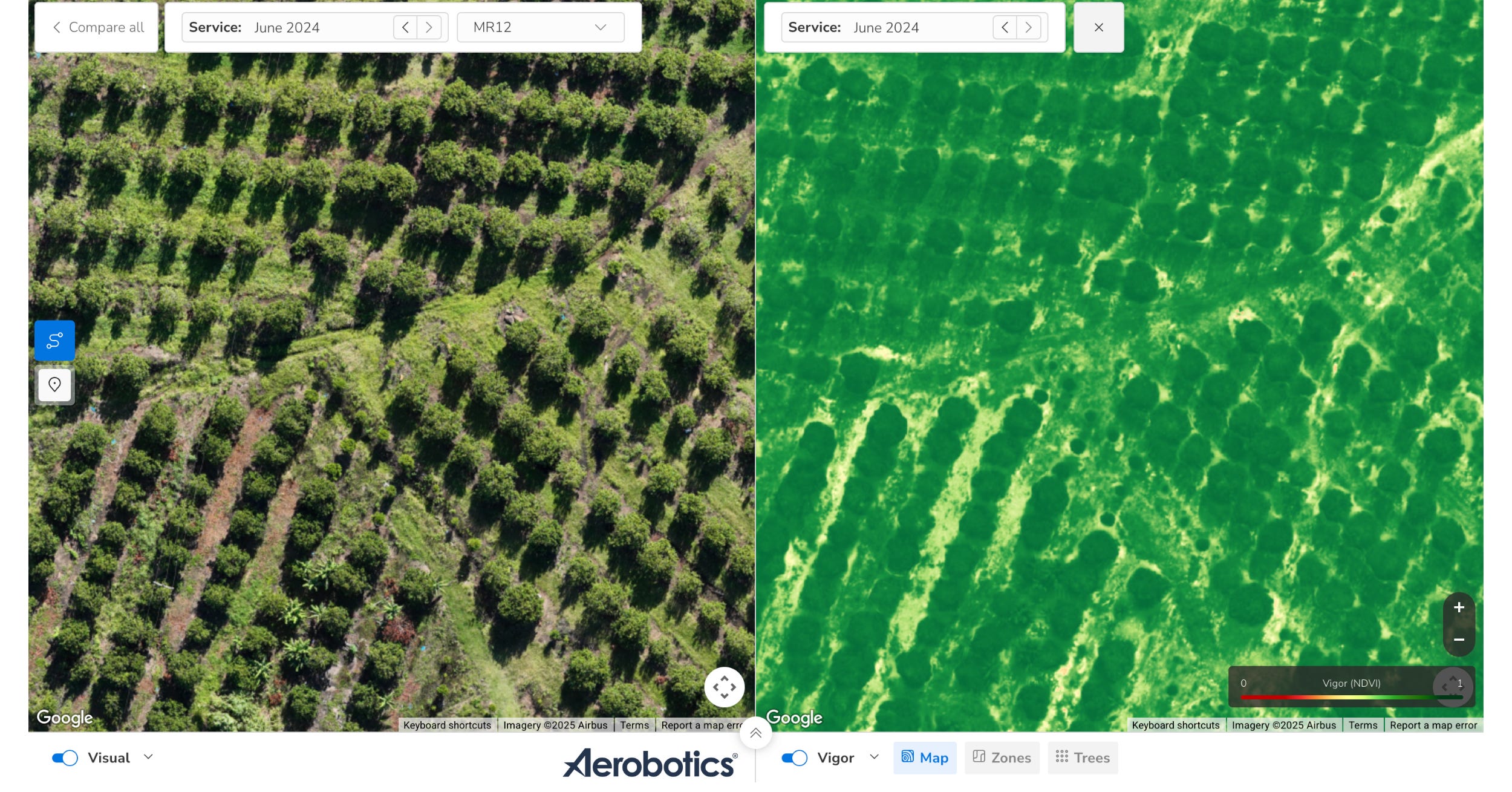
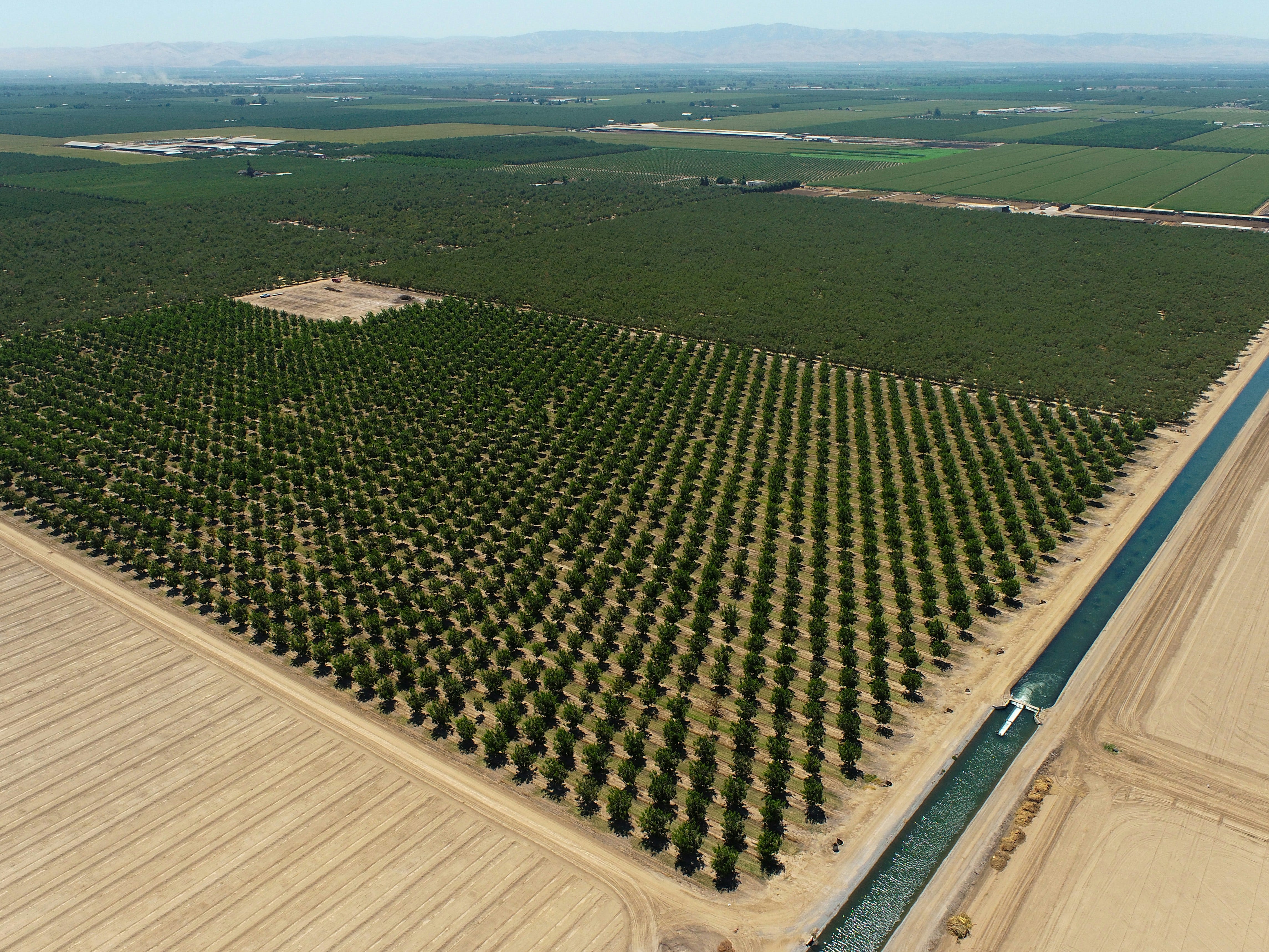
The map layer is usually the most familiar of these. It gives the standard top-down overview of the orchard and helps identify large-scale patterns, including areas of general decline, wind damage, flooding, poor establishment, cover-crop prevalence, changes in terrain after weather events, and other visible forms of variability.
This is why map layers are so useful. They give us the whole picture, not only one row, one corner of the orchard, or the few trees that happened to be inspected during a field visit. They give us a view of the entire block.
Why Map Layers Are Often the First Step
Drone data layers work well because they make variability visible. And this is especially useful in perennial crop systems, where problems can develop slowly and unevenly.
A block may look acceptable from the road, but the aerial view can reveal a different story. A drone layer may show poor establishment in a new planting, gaps in the orchard, weak zones linked to irrigation pressure problems, wind-damaged areas, drainage issues after heavy rain, uneven canopy development, or differences in vigour between cultivars, soil types, and management zones.
It may also show areas affected by flooding, heat stress, pest pressure, disease, cover crop variation, or changes in terrain after a weather event.
This is where map layers work well as standalone information. They help farmers and advisors ask better questions. Instead of wondering whether a block is doing well or not, the map encourages specific enquiries; a deep-dive if you will.
Why is the western side weaker?
Why are the trees along that contour line underperforming?
Why does the same patch keep showing lower vigour?
Is that poor growth linked to soil, water, disease, planting material, or management history?
Should we inspect that area before the issue spreads?
Etc….
That inquiry shift is important.
Map layers do not need to answer every question you have in order to be useful. Oftentimes they are valuable because they point attention in the right direction.
Where Data Layers Work Well on Their Own
There are five general situations where map layers are useful even without advanced zonal or per-tree analytics:
The first is visual baseline creation. A high-quality RGB map gives the farm a visual record of what the orchard looked like at a specific point in time. This is useful for seasonal comparison, replanting records, insurance discussions, infrastructure planning, and general farm documentation.
The second is large-scale pattern detection. If a block has an obvious area of decline, map layers can highlight it quickly. This is especially useful when the issue covers enough area to be visible from above. Irrigation failures, drainage lines, frost pockets, poor establishment zones, and damaged sections are often visible at layer level.
The third is communication. A drone map is an excellent communication tool because it helps farm owners, managers, agronomists, contractors, investors, and technical teams discuss the same area using the same visual reference. It reduces ambiguity. Instead of saying, “There is a weak patch near the bottom road,” you can point to the exact section on a map.
The fourth is scouting direction. Map layers can guide field teams towards areas worth inspecting. Even if the map does not diagnose the problem, it can improve the efficiency of field walking by narrowing down where people should look first.
The fifth instance is simple before-and-after comparisons. If a farm applies a treatment, repairs irrigation, replants a section, or improves drainage, repeated drone layers can help show whether the affected area is improving over time. This is not always a perfect quantitative analysis, but it is still useful, and visual change still matters.
Why Interpretation is Important
A map layer only becomes useful when it leads to a better question, a better inspection, or a better decision.
This is where interpretation becomes important. One challenge with map layers is that they can appear more conclusive than they really are. A colourful map can feel authoritative. Red looks bad, green looks good, and yellow looks average. But farming and orchard statuses are rarely that straightforward.
A low NDVI or NDRE area does not automatically mean disease. It could be related to tree age, canopy size, cultivar, soil type, water availability, pruning history, pest pressure, poor establishment, shade, bare soil, inter-row vegetation, or seasonal timing. And the list goes on.
This is why a weak section on a map should not be treated as a diagnosis. It is a signal. That signal must be interpreted through crop knowledge, seasonal context, ground-truths, and management history. This is especially important for high-value perennial orchard crops.
“A map layer only becomes useful when it leads to a better question, a better inspection, or a better decision.”
In tree crops, layer output imagery includes more than simply the tree canopies.
Depending on the crop, spacing, sensor resolution, and image processing method, the layer may also capture grass, weeds, cover crops, shadows, bare soil, trellis structures, inter-row vegetation, or open spaces between trees. This is what I often think of as “noise”.
“Noise” is not useless information, but information that can distort the reading if it is not separated from the crop itself. This is one of the reasons why per-tree data is so valuable in orchard analysis, once we go beyond the layer-only views.
The Difference Between Layers, Zones, and Per-Tree Data
A simple way to think about the difference is this: map layers help you see, zones help you organise, and per-tree data helps you pinpoint.
Each has value, but they are not the same.
While some dismiss map layer outputs altogether, others are mistaken in expecting map layers to do the work of zones or per-tree analytics. While assuredly underrated, it must be mentioned that layer-level info is the starting point, not always the final answer.
A map layer is broad and accessible. It gives a strong overview and is excellent for visual interpretation, communication, and early pattern recognition.
A zonal output is more structured. It simplifies complexity and helps convert spatial variation into practical management areas. Per-tree data is more granular. It allows for individual plant tracking, outlier detection, inventory management, and precise sampling or targeted intervention work.
Layers vs Zonal Info
A map layer shows the data as a continuous visual surface. A zonal representation simplifies that surface into practical management areas.
Instead of looking at every pixel or colour shift across the map, a zonal view groups similar areas together. These may be high, medium, and low vigour zones. They may be water stress zones, canopy development zones, management zones, or sampling zones.
This makes the information easier to act on.
A raw layer might show a complex pattern across the block. A zonal map takes that pattern and says, in effect, “These areas behave similarly. Treat them as a management group.”
That is useful because zones can support soil or leaf sampling, scouting route design, variability investigations, variable rate application strategies, representative sampling plans, and clearer conversations with farm teams.
This is where I want to link directly to the concept of composite drone data layers, because cluster-based sampling builds on this exact idea.
Instead of choosing sampling points randomly or simply walking the most convenient rows, you use drone-derived information to identify meaningful patterns. Then you sample in a way that represents those patterns.
That is a major step forward. The map layer shows the variability broadly speaking. The zonal views organise this variability visually. The sampling strategy investigates for the passible cause of the variation.
This flow is in essence how drone data begins to move us from a viewpoint of observation to position of decision support.
Layers vs Per-Tree Data
Per-tree data takes the analysis one level deeper.
Instead of looking at the block as a surface, platforms that focus on per-tree assets identify each tree and assign information to that individual plant.
This may include canopy area, indicative vegetative volume, vigour, health, thermal stats, stress ranking, or other plant-level metrics.
This is more precise than a general layer. Trees become the basis of analysis. The system is not asking, “What does this area of the map look like?” It is asking, “What is happening with this tree / set of trees?”
That shift matters in perennial orchards and vineyards because these areas are made up of individual productive assets. Each plant has a location, a history, a canopy size, and a contribution to the overall productive capacity of the block.
Per-tree data allows farmers to identify outliers: weak trees, missing trees, exceptional trees, trees that are declining before the broader area looks obviously poor, and trees that should be inspected, treated, monitored, or replaced.

This does not mean every tree needs a separate management decision. That’s not practical for most farms. But per-tree data gives a cleaner foundation for creating better zones, better sampling strategies, and better intervention priorities. In many orchard contexts, per-tree data helps remove some of the noise that can affect general map layers.
If the analysis is based on the tree canopy itself, rather than the full visual surface of the orchard, the output becomes more crop-specific. That matters when inter-row vegetation, bare soil, shadows, weeds, and mixed canopy sizes are present.
Using Drone Data Layers at the Right Level
Thanks for sticking with me this far into the article.
Here’s a bit of a summary to drive the point home:
Drone data layers are useful because they reveal broad spatial patterns. They help farmers see where variability exists, where a block looks uneven, where the team should inspect, and what may have changed visually over time.
In many cases, that is already enough to create value. If the question is simple, visual, and spatial, a map layer may be sufficient to guide the next practical step.
This is especially true when identifying obvious missing trees, flood-affected areas, poor establishment, visible drainage issues, damaged sections, or broad canopy differences between parts of a block.
To reiterate again… the data layers do not need to provide every answer. They simply need to point attention in the right direction.
But there are also situations where map layers alone are not enough. If the decision requires accurate plant counts, per-tree canopy measurements, individual tree rankings, representative sampling locations, variable rate application zones, or a clean separation between crop canopy and inter-row vegetation, then a general layer has reached its limit. This is where the practical difference becomes important.
Map layers help us see. Zones help us organise, and work with increased efficiency. Per-tree data helps us with pin-point accuracy and granular data.
Each step increases precision, but each step also requires better interpretation, better data handling, and a clearer management question.
After analysis (whichever type of data output you choose) the next step is ground-truths. Field teams still need to inspect representative areas and look at leaves, soil, roots, irrigation hardware, pest signs, disease symptoms, canopy condition, and fruit load, etc etc… where relevant.
If per-tree data is available, it can then be used to identify outliers, track individual tree performance, support inventory management, and refine intervention priorities. Only then does the data fully move into action.
For example: Adjust irrigation. Repair infrastructure. Sample more intelligently. Apply nutrition more precisely. Scout pest-risk areas. Replant missing trees. Follow up after treatment. Then verify the result by flying again, comparing, learning, and improving.
This is the management loop I keep coming back to:
Detect, prioritise, act, verify, and repeat.
In closing, remember that drone data layers fit beautifully into that loop, but they work best when they are treated as part of a decision system, not as the whole system. Their real value is not that they give farmers perfect answers. Their value is that they improve the quality of the questions.
They help us see variability sooner, direct attention more intelligently, communicate problems more clearly, compare change over time, and decide where deeper interpretation is needed.
The best precision agriculture workflows understand the role of each output. They do not confuse visibility with diagnosis. They do not confuse colour with certainty. They do not confuse data with decisions.
They use each output at the right level.
That’s where drone data becomes practical. Not because it gives us a beautiful map and “pretty pictures” but because it helps us manage uneven problems with better focus, better timing, and better evidence.
Want to Go Deeper?
This topic is covered in more detail in my book, Drone Data Metrics for Orchard Farming, where I unpack the core drone-derived outputs used in perennial crop systems, including RGB imagery, digital elevation models, NDVI, NDRE, canopy metrics, plant census data, thermal information, zonal outputs, per-tree analytics, and AI-backed precision (AKA “Smart”) sampling.
The goal of the book was simple: to help farmers, agronomists, and decision-makers move from pixels to practical decisions with info that’s relatable and accessible.
Because, “maps are not the goal. Management is.”
The thinking starts here, but the real change starts when we take action.
— Ken